Messaging Analysis and Visualization
About a year ago I attended a Meetup on D3.js. The first talk by Michael Dezube was on using machine learning to analyze text messages and visualize the results. Today I want to walk through all the awesomeness we have in this project.
Demo
The first chart we see is this
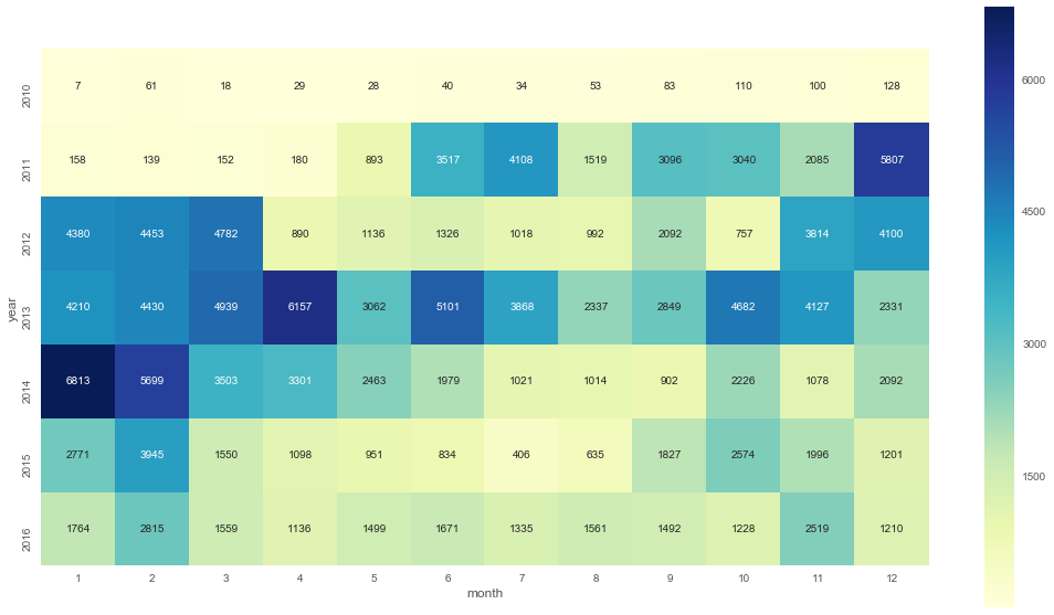
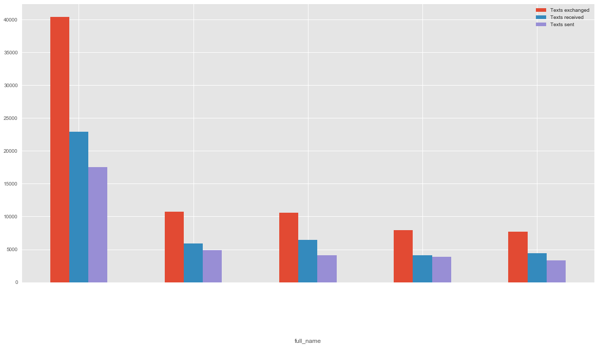
Here it shows us our messaging habits over the years. Fascinating how it varies! But let's dive deeper. The important question is: Who did we message? We can display the top N people:
But who did we message and when?
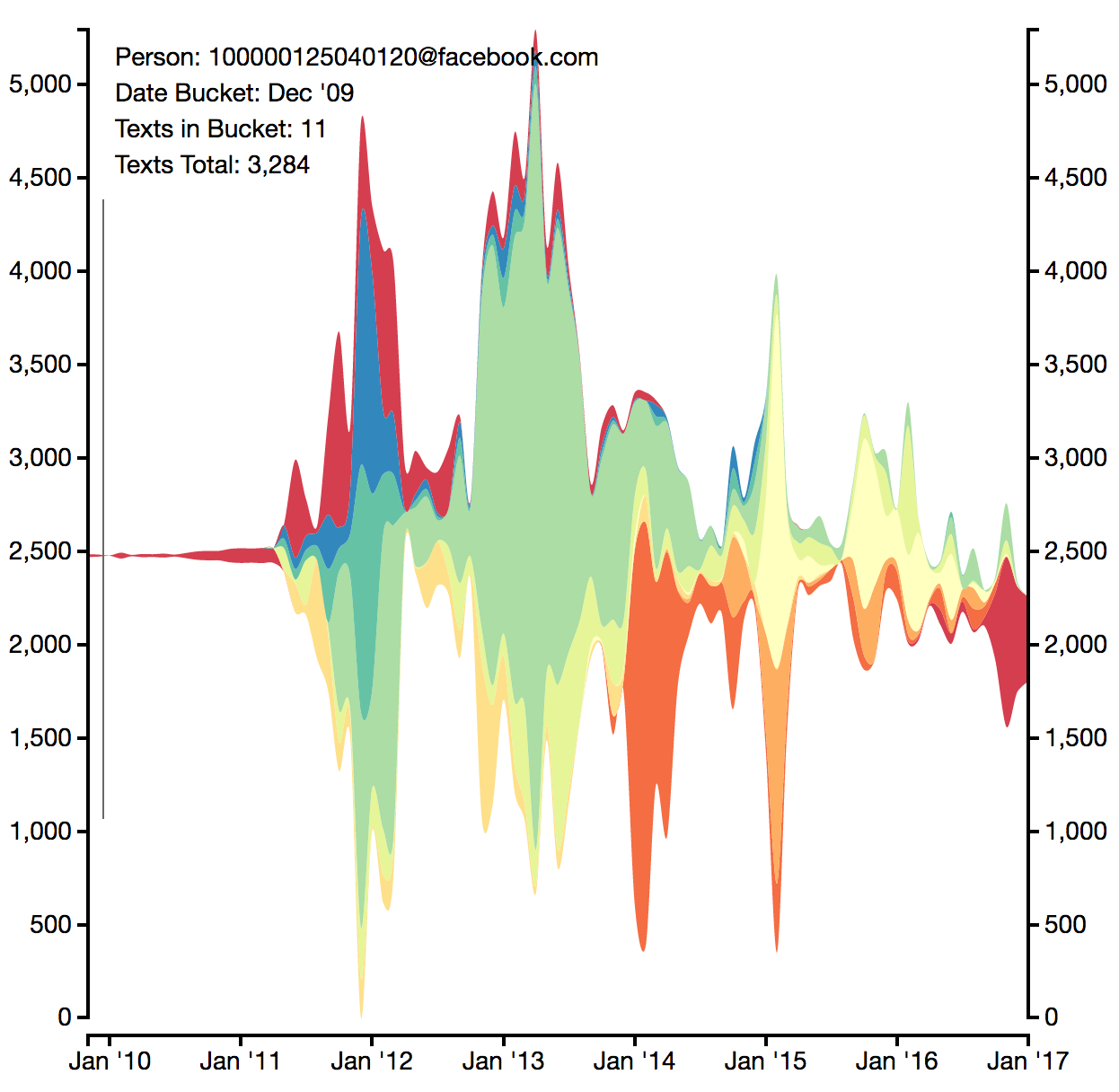
This graph is great! It's almost a history of my life. Looking back at it, I can see when I made friendships and how they were developing. This is probably my favorite visualization!
After that we have a word cloud and a tree for visualizing conversations, but it's a little too personal for me to post online.
Later in the Jupyter notebook we find a chart that shows us our top words over the years, accounting for the relative frequency in other years:
Here we see me moving to the US, but also how I was interacting. The blacked out sections are names of people. Fascinating who I was talking about 😉.
This project has not seen any attention in the last months, but there is still so much more to explore.
How it works
We start by loading the data into our notebook
import iphone_connector
iphone_connector.initialize()
fully_merged_messages_df, address_book_df = iphone_connector.get_cleaned_fully_merged_messages()
The connector does all the heavy lifting. The iphone_connector accesses the latest iPhone backup and reads all text messages from its database. The facebook_connector uses fbchat_archive_parser to read a user's archive of chat messages. Now we have fully_merged_messages_df and address_book_df, both of which are Pandas Dataframes.
Once we have the messages we can create the heatmap. First we group our messages by month:
month_year_messages = pd.DataFrame(df['date'])
month_year_messages['year'] = month_year_messages.apply(lambda row: row.date.year, axis=1)
month_year_messages['month'] = month_year_messages.apply(lambda row: row.date.month, axis=1)
Then we create a pivot table that contains the number of messages per month.
month_year_messages_pivot = month_year_messages.pivot_table(index='year',columns='month',aggfunc=len, dropna=True)
month_year_messages_pivot = month_year_messages_pivot[month_year_messages_pivot.count(axis=1) == 12]
After that we feed the data into the plotting tool.
Next we want to create the barchart to see who we have messaged the most in the past. We group the messages by message partner and count how many you sent and received.
def get_message_counts(dataframe):
    return pd.Series({
      'Texts sent': dataframe[dataframe.is_from_me == 1].shape[0],
      'Texts received': dataframe[dataframe.is_from_me == 0].shape[0],
      'Texts exchanged': dataframe.shape[0]
    })
messages_grouped = fully_merged_messages_df.groupby('full_name').apply(get_message_counts)
messages_grouped = messages_grouped.sort_values(by='Texts exchanged', ascending=False)
By combining the ideas from the two charts above we can create the chart that shows our interactions with friends over time. We select our TOP_N friends and count how many messages we sent them each month.
sliced_df = fully_merged_messages_df[fully_merged_messages_df.full_name.isin(messages_grouped.head(TOP_N).index)]
grouped_by_month = sliced_df.groupby([
    sliced_df.apply(lambda x: x.date.strftime('%Y/%m'), axis=1),
    'full_name']
)['text'].count().to_frame()
After that we graph it using D3.js.
The final chart - our most used words per year - requires us to dive into NLP. We'll be using Tfidf (term-frequency times inverse document-frequency) to calculate the relevance of each word.
from sklearn.feature_extraction.text import TfidfVectorizer
from nltk import tokenize
vectorizer = TfidfVectorizer(preprocessor=clean_text, tokenizer=tokenize.WordPunctTokenizer().tokenize, ngram_range=(1, 2), max_df=.9, max_features=50000)
grouped_by_name = fully_merged_messages_df[fully_merged_messages_df.is_from_me == 0].groupby('full_name')['text'].apply(lambda x: ' '.join(x)).to_frame()
vectorizer.fit(grouped_by_name.text)
The above code identifies the most relevant word for a certain chat partner, but important is, that it trains our TfidfVectorizer. We can now use it to find the prominence of a word in a given year.
grouper = slice_of_texts_df.date.apply(lambda x: x.year)
grouped_by_year = slice_of_texts_df.groupby(grouper).apply(
  lambda row: pd.Series({'count': len(row.date), 'text': ' '.join(row.text)})
)
grouped_by_year_tfidf = vectorizer.transform(grouped_by_year['text'])
Now we need to find the most important word in comparison to other years.
sorted_indices = (tfidf_this_year - tfidf_other_years).argsort()[::-1]
df = pd.DataFrame({this_year: word_list.iloc[sorted_indices[:top_n]]})
My contribution
After the presentation I was super excited about the idea and wanted to try it out. When I first tried it, it only supported iPhones. I decided to add a Facebook Chat connector. It still has minor issues, such as an ID not being properly resolved, but it works (in fact all those charts above use my FB data).
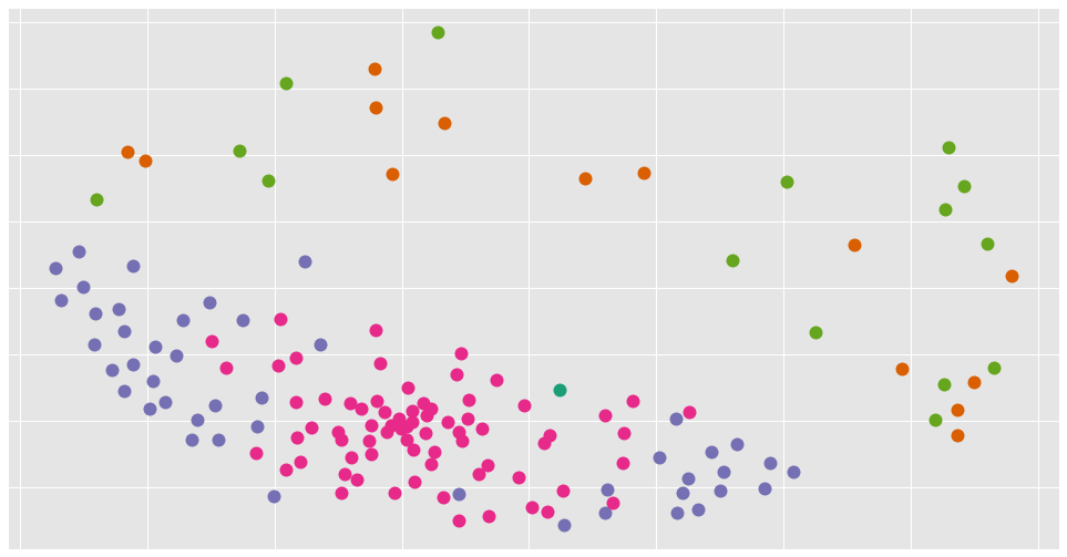
I have also been looking into clustering. Having the word vectors would allow us to cluster our text/chat partners and see who we interact with similarly. I am still working on it, but below is how a first draft looks (names purposefully omitted).
Check it out
I'd recommend anybody to check out the repository. Michael has been awesome in reviewing my code and gave me so many helpful tips. You can find the repository here.
Published on 2018-02-14.